The client arrived with a studio-built site that didn’t fit her strategy: unclear value,
hard-to-choose programs, and unreliable forms. We rebooted from UX and rebuilt the product end-to-end.
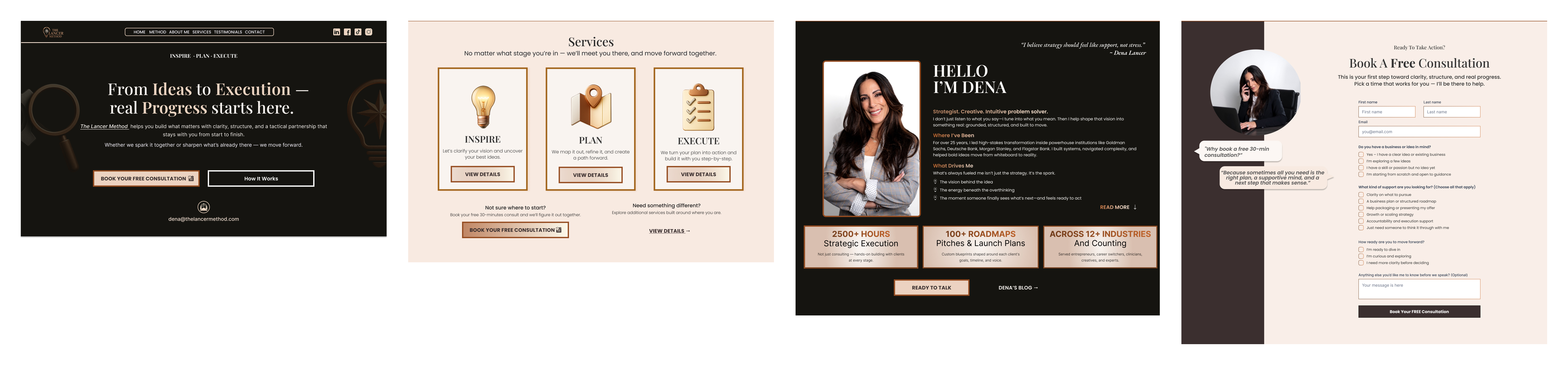
Clarify the offer: who it’s for, outcomes, and how to start — above the fold.
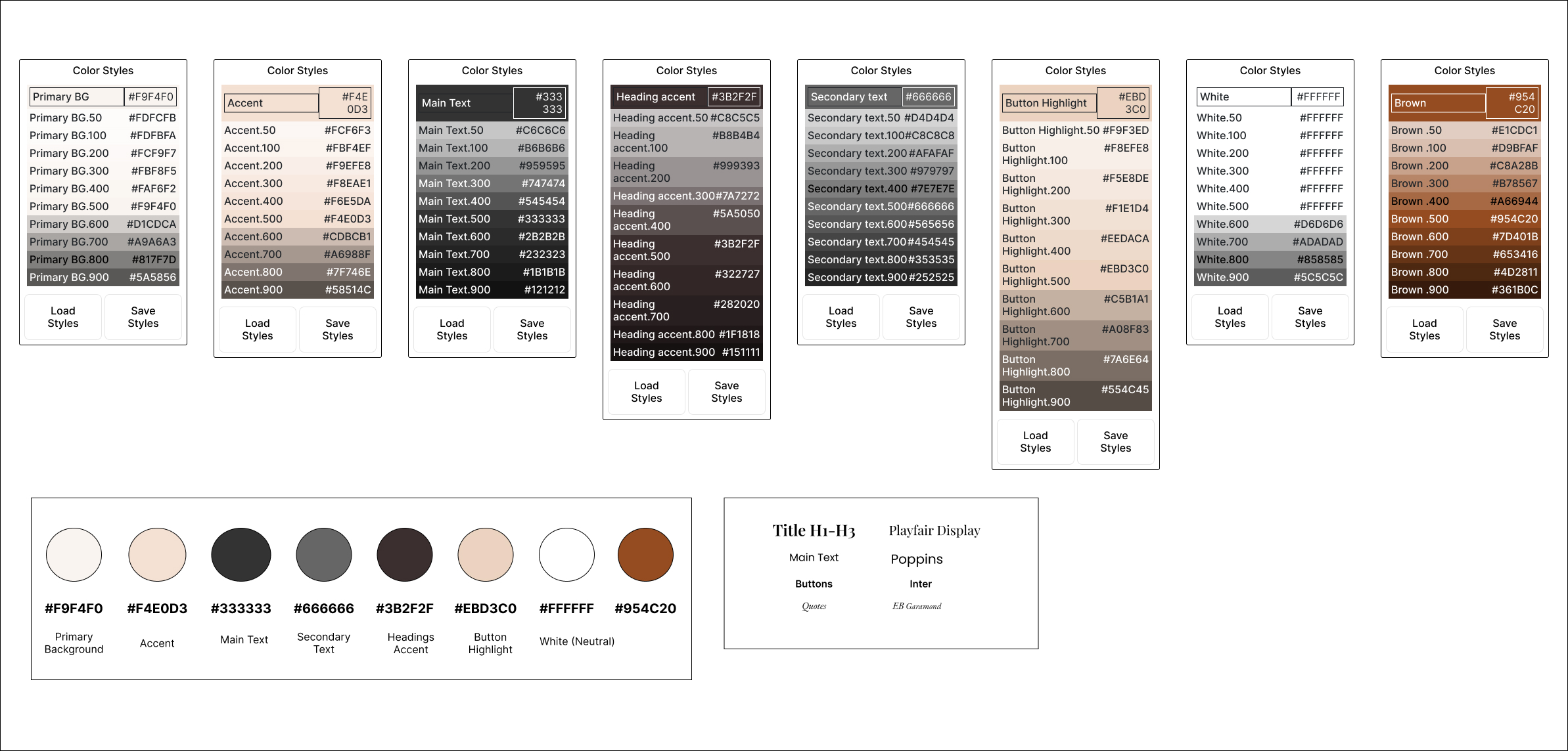
UX first: FigJam flows → Figma wireframes & high-fidelity UI with a tight style system.
Conversion & accessiblity: mobile-first layout, large tap targets, clear CTAs, WCAG-minded patterns.
Forms that deliver: custom handling + Gmail SMTP for reliable inbox delivery.
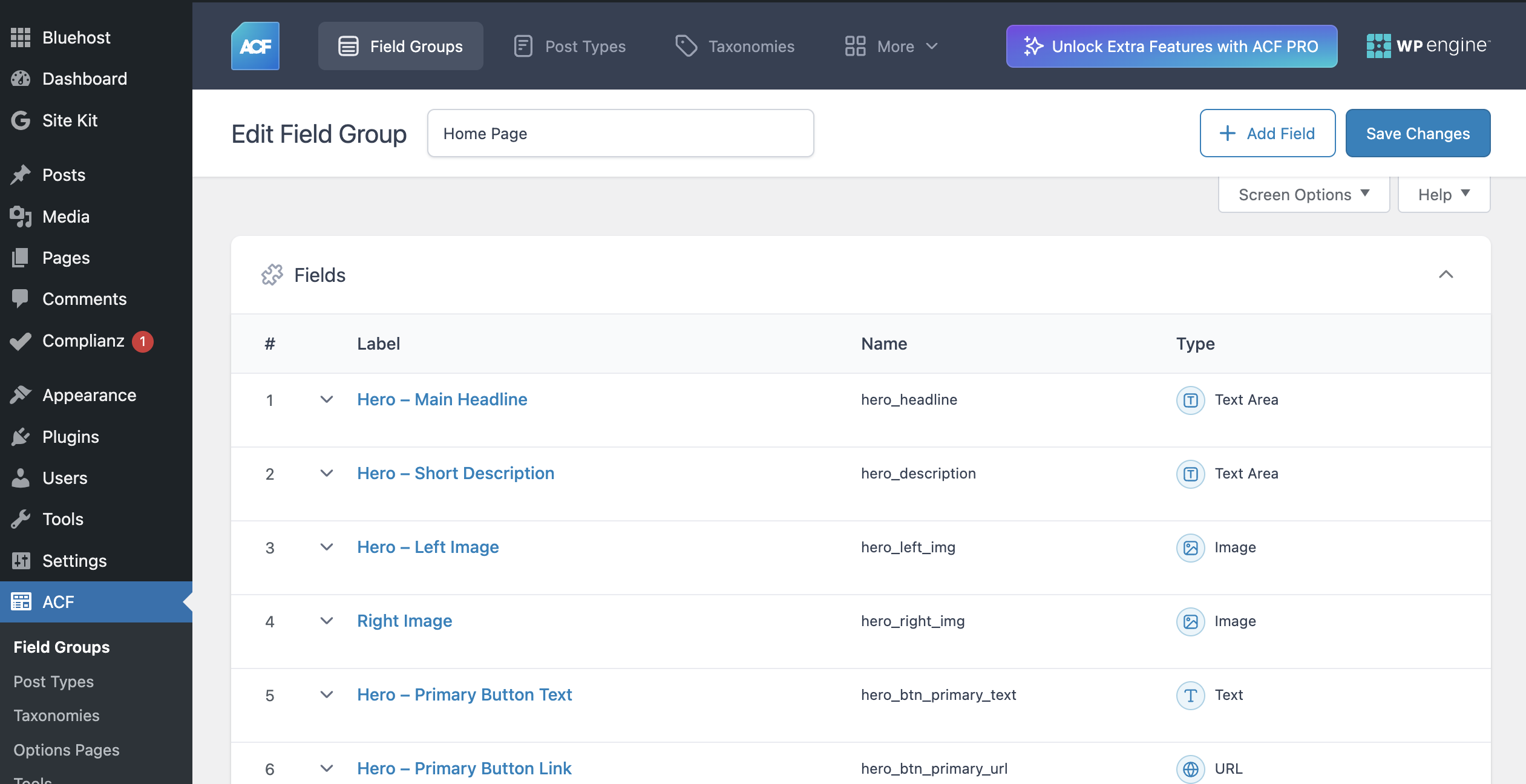
Owner-friendly content: WordPress + ACF so Programs/FAQs can be edited without a developer.
Quality bar: improved SEO, performance, and core accessibility.
Scope: Full product package — UX research → Figma prototypes → production front-end;
WordPress (ACF) integration in progress.
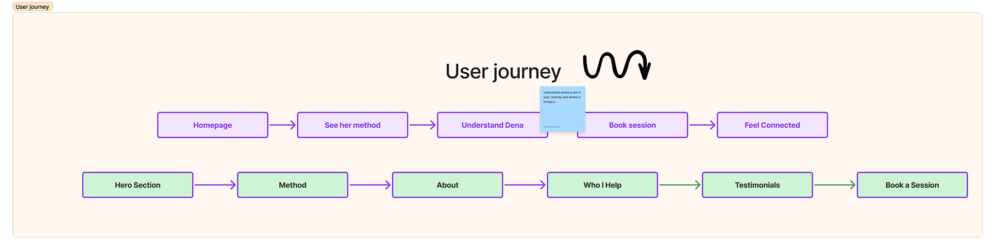
UX Research → Structure
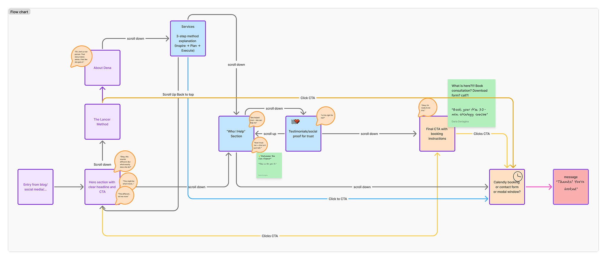
I used FigJam to explore how prospective clients would move through
the site — from first click to booking a session. This process included mapping
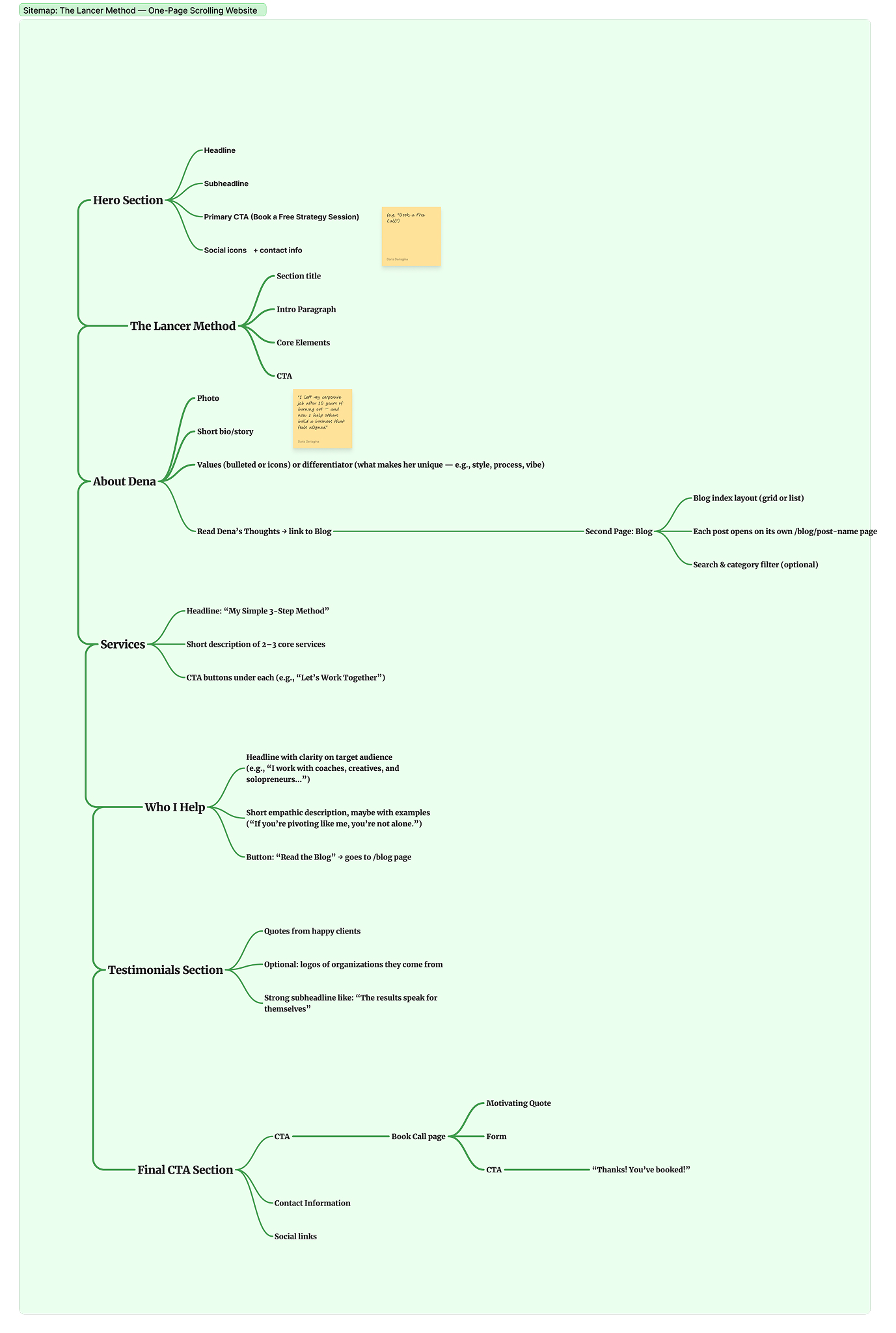
the flow of CTAs, a clear sitemap, the user journey, and three
personas with pain points and goals. Together, these artifacts shaped the
final information architecture and messaging.
Flow chart: mapped how users scroll, encounter CTAs, and move into the booking funnel.
Sitemap: defined a one-page structure with clear sections (Hero, Method, About, Who I Help, Testimonials, Final CTA).
User journey: visualized the step-by-step path from discovery → understanding → trust → booking.
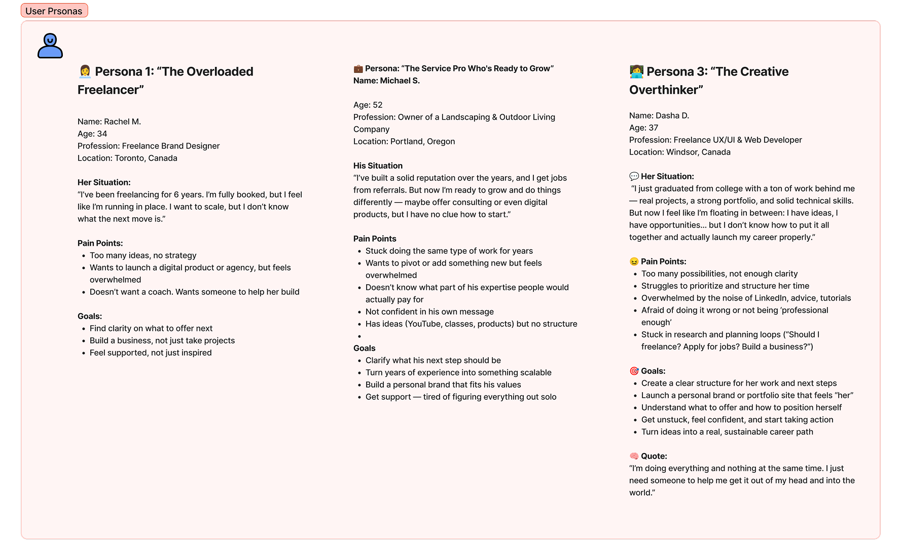
Personas: identified three archetypes (Overloaded Freelancer, Service Pro, Creative Overthinker) with pain points and goals.
These insights gave me confidence that every section answered a real user
question — and that no matter where someone entered, there was always a
clear path toward booking a session.
Wireframes (Black & White)
Validating hierarchy and messaging before visuals.
Mobile UI (from Figma Components)
I built a mobile-first system: stacked sections, sticky bottom CTAs, and readable forms.
The UI follows Figma tokens (type scale, spacing, colors).
Mobile UI collage — key screens shown together for context
Mobile flow walkthrough (home → program → apply form)
What I Solved
Messaging & IA: clarified who it’s for, outcomes, and next steps; fewer choices, stronger CTAs.
Forms that work: custom PHP handler, server-side validation, clear errors/success states.
Deliverability: Gmail SMTP with SPF/DKIM guidance → reliable inbox delivery.
Content model: ACF field groups for Programs, Testimonials, FAQs → no-code updates.
Accessibility: labels, input descriptions, focus states, color-contrast, keyboard nav.
Web Vitals: image lazy-loading, font preconnect, minimized JS, structured headings.
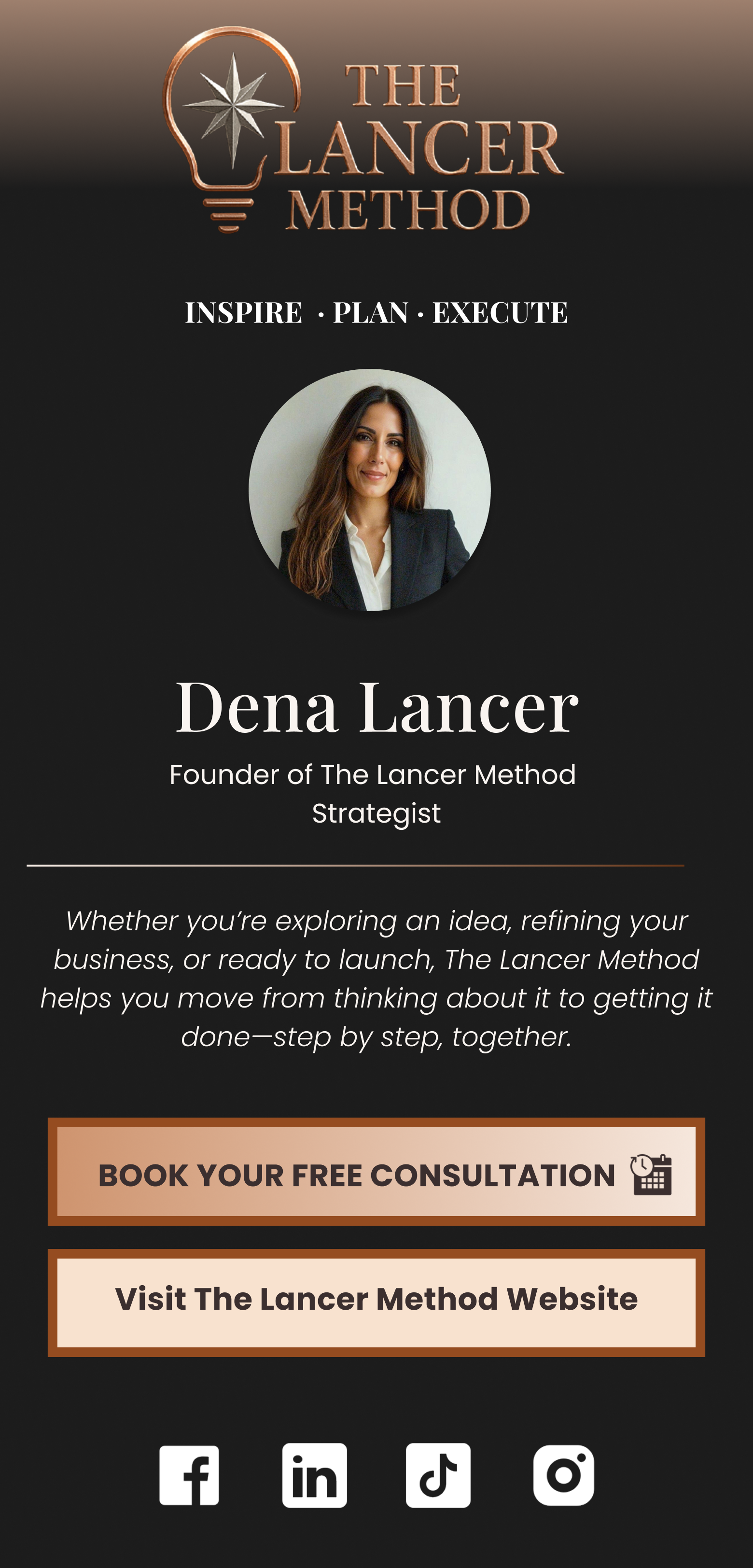
Trust: testimonials, certifications, real photos, and consistent tone of voice.
I’m Dasha — a designer-developer focused on accessible UX and clean WordPress builds.
For The Lancer Method, I delivered a maintainable system with forms that actually reach the inbox. 💌

 Open live