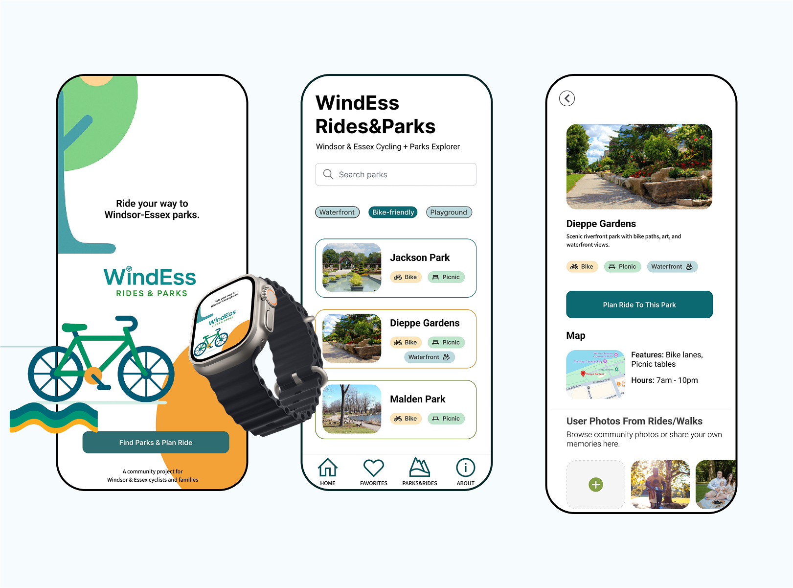
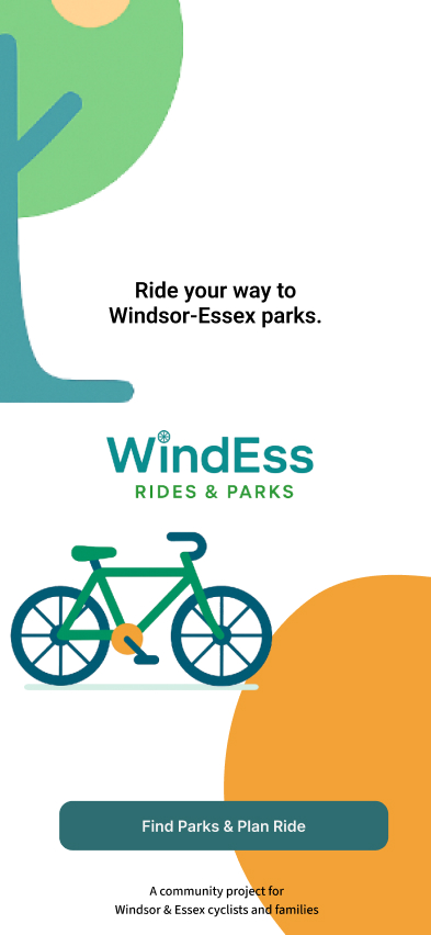
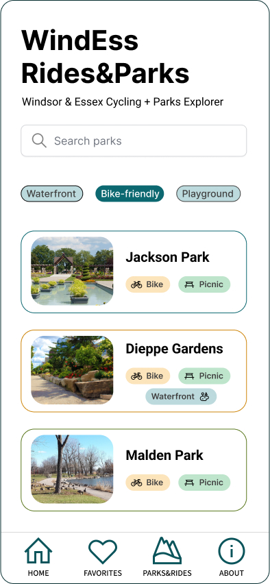
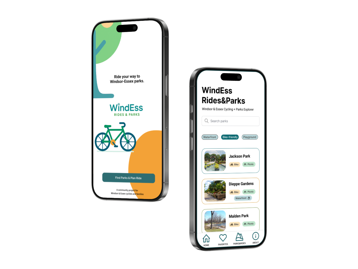
WindEss helps people discover Windsor–Essex parks and plan
bike-friendly routes. I designed the flow in Figma (8 core screens)
and implemented a working prototype in React: search → park detail →
route planner → route results with an interactive map and turn-by-turn
steps.
From low-fi wireframes to a functional React prototype
This project was scoped as a
minimum viable prototype (MVP) — the goal was not to
launch a full production app, but to
demonstrate the concept for stakeholders and validate the
user journey.
What We Solved
Users struggled to discover safe, bike-friendly parks in
Windsor–Essex.
Existing maps were cluttered and not optimized for mobile use.
Families wanted quick access to practical info (washrooms,
playgrounds, parking) without digging through multiple sites.
How We Solved It
Wireframes first: sketched and tested 8 low-fi
screens to validate flow (search → detail → planner → results).
Prioritized hierarchy: park essentials appear above
the fold (hero photo, tags, hours, location mini-map).
Mobile-first design: bottom navigation + large tap
targets for one-hand use while cycling.
Why This Matters
Instead of presenting static Figma mockups, the interactive React
prototype allowed the client to experience the idea — testing
flows on a real device and seeing how maps and routing would work in
practice. This de-risked the concept and gave clear evidence for
future investment.
Problem & Goals
Cyclists and families want safe, bike-friendly routes to local parks
with clear amenities and a simple, tap-friendly mobile UI.
Search parks by features (Bike-friendly, Waterfront, Picnic,
Playground).
See essentials fast: hero image, tags, hours, mini-map.
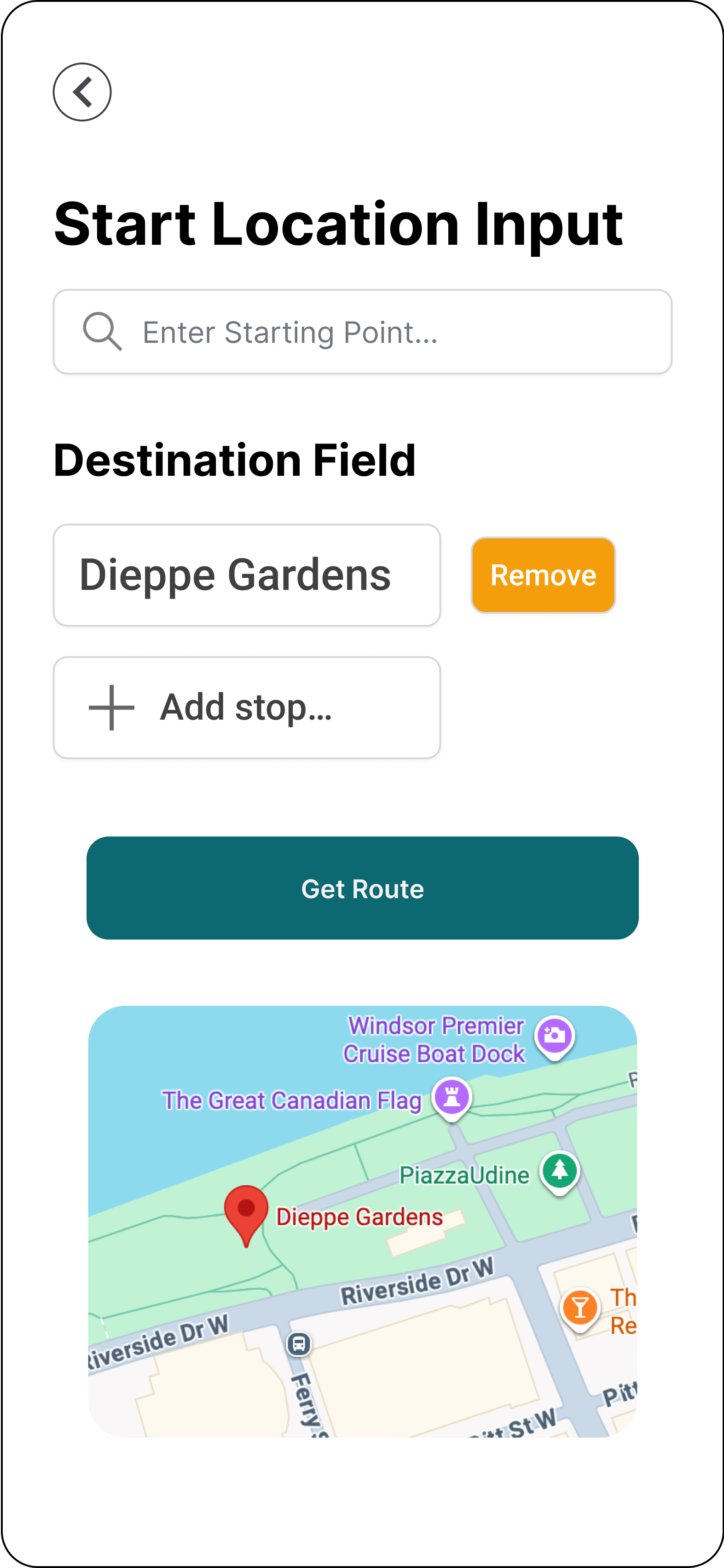
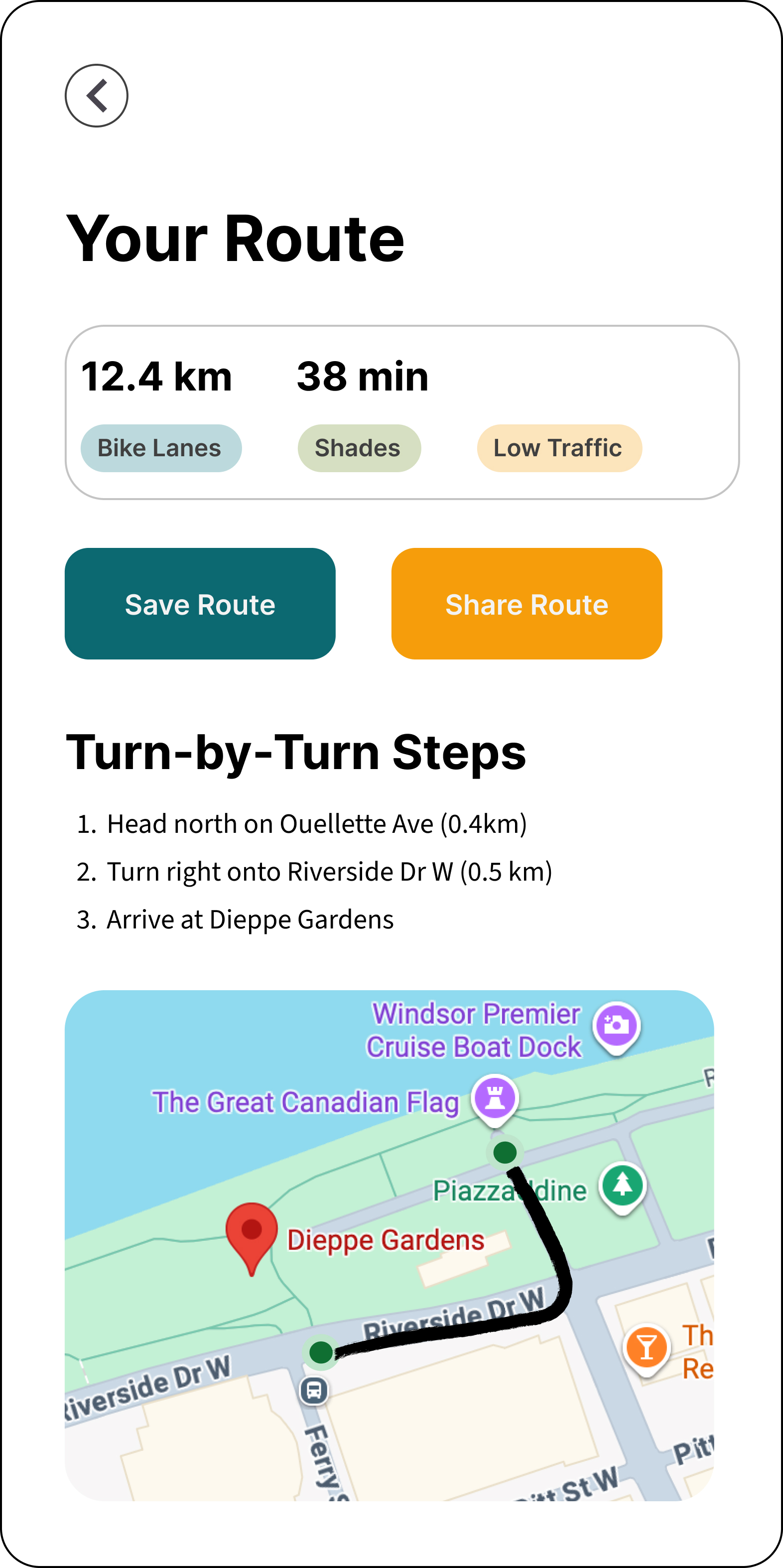
Plan a route with “Use my location” and get clean turn-by-turn
steps.
Wireframes (Black & White)
Early mobile-first wireframes used to validate flow and hierarchy
before committing to UI polish.
User Flow (8 Screens)
Prototype Walkthrough
Short demo of the React prototype: search → detail → planner → results
(OSM map + polyline + steps).
Walkthrough of the functional prototype (mobile view)
Design Decisions
Readable hierarchy, large tap targets, and chip filters to reduce
cognitive load.
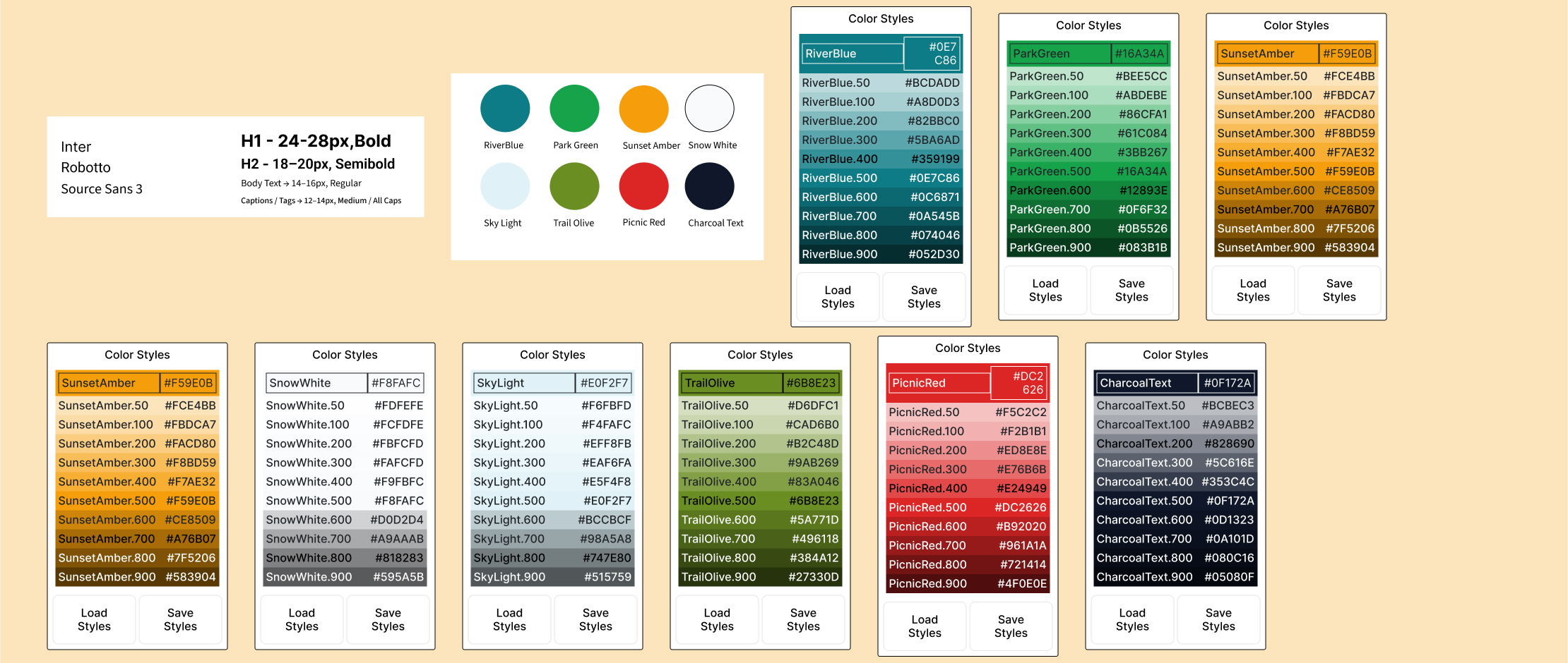
Calm outdoor palette (teal/amber/neutrals) with accessible contrast.
Generated consistent color scales & shadows using the
Color Levels Generator Figma plugin — ensuring reusable
tokens across components.
Nav pattern: keep bottom nav on lists; focused back arrow on detail.
Palette & component tokens, extended via Color Levels Generator
Tech Notes
React components with inline styles for quick iteration.
OpenStreetMap tiles (embed + React-Leaflet for interactive map).
OSRM public endpoint for bike routing; parsed steps for readable
turn-by-turn.
Hi! I’m Dasha — a designer & developer focused on clean,
mobile-first UX. WindEss is an MVP to validate the idea fast: real
maps, routing, and a clear flow users can test on device. 🌿